Moon Interiors
Concept site for a speculative lunar-habitat interior design studio. A brand + typography showcase, not a real client.
Overview
Moon Interiors is a self-initiated concept project — a speculative brand and web experience for a fictional lunar-habitat interior design studio. The brief was entirely internal: use a made-up premise (designing interiors for moon bases) as a vehicle for an editorial web build that exercises typography, spacing, and motion craft without the constraints of a client brand book.
The problem
Concept sites usually fail in one of two ways: either the worldbuilding gets so loud it reads as a gimmick, or the design is so restrained that the premise disappears and you're left with another minimalist template. The challenge was landing exactly in the middle — letting the lunar conceit drive every copy decision, section label, and interaction detail, while keeping the visual system disciplined enough that the site feels like a real design studio's portfolio and not a sci-fi fan project.
What we built
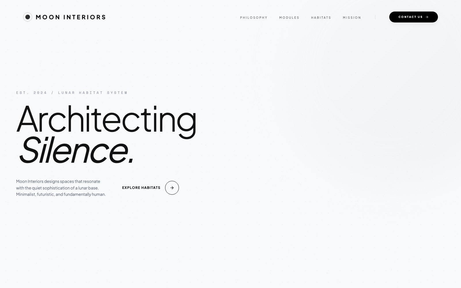
- Built a strict two-typeface system — Plus Jakarta Sans for display/editorial weight, Space Mono for accents, eyebrows, and interface labels — so every 'EST. 2024 / LUNAR HABITAT SYSTEM' caption carries the same mission-patch feel without needing decorative assets.
- Anchored the hero around the phrase 'Architecting Silence' — a tagline that commits to the lunar premise while sounding like it came out of a real interior design practice, on a near-white (#F8F9FA) backdrop with a subtle dot-grid pattern suggesting architectural drafting paper.
- Structured the page into five narrative modules — Philosophy, Modules (Residential / Commercial / Bespoke), Habitats (a filterable project grid), Mission (the process), and Contact — each one reinforcing the same worldbuilding vocabulary without repeating visual motifs.
- Rebranded conventional UI affordances with mission-language equivalents: the contact form asks for 'Subject Name', 'Contact Protocol', and 'Mission Brief' instead of Name / Email / Message; the process steps are 'Analysis → Concept Arch → Refinement → Deployment'; the header CTA is 'CONTACT US' stamped inside a pill with the same monospace.
- Built the whole thing as a single Vite bundle on Firebase Hosting — sub-second page load, Framer Motion for entrance animations, filter tabs that cross-fade the habitats grid, and a navigation bar that keeps its dark pill CTA visible at every scroll position.
Key features
- Editorial typographic system — Plus Jakarta Sans display + Space Mono accents
- Architectural dot-grid background evoking drafting paper
- Five narrative modules — Philosophy, Services, Habitats, Process, Contact
- Filterable 'Habitats' project grid (All / Residential / Commercial / Hospitality)
- Four-phase process section — Analysis → Concept Arch → Refinement → Deployment
- 'Mission Brief' contact form with in-universe field labels
- Framer Motion entrance animations respecting prefers-reduced-motion
- Single-bundle Vite build on Firebase Hosting — sub-second first paint
Results
The concept site is live at moon-interios.web.app and functions as a portable demonstration piece — a reference for how far a restrained two-typeface system and disciplined copy can carry a fictional brand. The project also seeded the typographic patterns (monospace eyebrows, oversized display headlines, editorial spacing) that now appear in several HeliosFlow client builds.
Single-page site with Plus Jakarta Sans + Space Mono, a dot-grid backdrop, and a four-module narrative. Shipped in two weeks.
What we learned
- Writing the brand voice document before any visual design is the highest-leverage hour on a concept project — it keeps every later decision honest.
- A two-typeface system is not a limitation; it's the constraint that forces you to solve hierarchy with size, weight, and spacing instead of decorative assets.
- In-universe copy (field labels, section names, CTAs) is what makes a fictional brand feel real — far more than illustration or photography choices.
Stack
Have a similar project?
Tell us what you're building and the deadline. We'll reply in 24 hours — with either a scoped proposal or an honest "not our fit".